datarich(ard)
a personal journey into data science
Intro to tidyverse
by datarich(ard)
R Markdown
This is an R Markdown document. Markdown is a simple formatting syntax for authoring HTML, PDF, and MS Word documents. For more details on using R Markdown see http://rmarkdown.rstudio.com.
Tidyverse
We will need the readxl package from tidyverse to import the excel file into R. We will need the ggplot2 package from tidyverse to create the plot. Tidyverse is a set of packages which includes useful tools for data import into R (e.g., haven, readr, readxl), data manipulation (e.g., dplyr, tidyr), as well as functional programming (e.g., purrr). For more info about ggplot2 see https://ggplot2.tidyverse.org/index.html.
If you haven’t installed tidyverse on your harddrive, then you will need
to download and install it. In RStudio, use the Tools menu and
Install Packages..., then type in “tidyverse” to download and install.
Or you can download and install it from the command line (console
window) in RStudio using install.packages("tidyverse")
In each case, the default options should work.
After installation, everytime we want to use a package in the tidyverse
we must load it into RAM using the library command. Normally this is
included as boilerplate at the top of your script. In this case we will
need to separately load the readxl package, because although it is
part of the tidyverse, it is not loaded by default with the
library(tidyverse) call unlike the other packages (e.g., ggplot2).
library(tidyverse)
## ── Attaching packages ─────────────────────────────────────── tidyverse 1.3.0 ──

## ✓ ggplot2 3.3.3     ✓ purrr   0.3.4
## ✓ tibble  3.0.6     ✓ dplyr   1.0.4
## ✓ tidyr   1.1.2     ✓ stringr 1.4.0
## ✓ readr   1.4.0     ✓ forcats 0.5.1

## ── Conflicts ────────────────────────────────────────── tidyverse_conflicts() ──
## x dplyr::filter() masks stats::filter()
## x dplyr::lag()    masks stats::lag()
library(readxl)
Import
Often the hardest part is figuring out how to import excel files into R.
This is because excel is a terrible way to manage data and almost any
other method (STATA, SPSS, csv) is better (excel is a great way to play
with data). We need to know the sheet name and the cell reference of the
data in the worksheet we want. Examining the excel workbook reveals to
me there are four tables (each 2-columns wide) in a single sheet, so I’m
just going to import each table separately using read_excel() and the
cell references in Excel.
path_to_excel_file <- "../assets/WRIGHT_t-tests_primary outcome data.xlsx"

recommendations <- read_excel(path = path_to_excel_file,
                              range = "B3:C54")

objections <- read_excel(path = path_to_excel_file,
                         range = "E3:F54")

efficacy <- read_excel(path = path_to_excel_file,
                       range = "H3:I54")

concerns <- read_excel(path = path_to_excel_file,
                       range = "K3:L54")
Because read_excel() is a tidyverse function, it will import the
results as a tibble object (think of a “little table”), and tibbles are
very easy to work with. For instance, the results can be examined very
simply:
concerns
## # A tibble: 51 x 2
##    Control  MDMA
##      <dbl> <dbl>
##  1       7     2
##  2       4     7
##  3       8     7
##  4       8     8
##  5       5     8
##  6       4     8
##  7       7    10
##  8       6    10
##  9       9     5
## 10      10     7
## # … with 41 more rows
The printed output tells us concerns is a tibble, with 51 rows, 2
columns with headings “Control” and “MDMA” respectively. This is called
“wide” format, and while you are probably used to working with “wide”
tables, it is not a great format to manipulate with code. One reason is
because in it’s current form it contains missing values. tail() lets
us look at the bottom of the tibble:
tail(concerns, 10)
## # A tibble: 10 x 2
##    Control  MDMA
##      <dbl> <dbl>
##  1       1     6
##  2       3     4
##  3       4    NA
##  4       8    NA
##  5       7    NA
##  6       6    NA
##  7       7    NA
##  8       5    NA
##  9       7    NA
## 10       5    NA
The final 8 rows of MDMA are filled with <NA>, which is R’s way of
telling us the data is missing. This is expected because there are fewer
numbers of observations in the MDMA group than the Control group. R can
ignore these missing values but it will provide lots of “helpful”
warnings and so for the sake of our sanity let’s put the data into
“long” format. This brings us to the “preprocessing” stage.
Preprocessing
We can put each tibble into long format with a simple pivot:
concerns_long <- pivot_longer(data = concerns,
                              cols = everything())
The output is a longer tibble containing one observation per row, and the first column represents the group name while the second column represents the observed value:
concerns_long
## # A tibble: 102 x 2
##    name    value
##    <chr>   <dbl>
##  1 Control     7
##  2 MDMA        2
##  3 Control     4
##  4 MDMA        7
##  5 Control     8
##  6 MDMA        7
##  7 Control     8
##  8 MDMA        8
##  9 Control     5
## 10 MDMA        8
## # … with 92 more rows
When data is represented with one unique observation per row and each column is a different variable-type it is called “tidy” format, and this is now very easy to work with since each column represents a different feature of the dataset.
However there are still <NA> values in this tibble because R has
helpfully pivoted the missing values into the long format as well:
tail(concerns_long, 10)
## # A tibble: 10 x 2
##    name    value
##    <chr>   <dbl>
##  1 Control     6
##  2 MDMA       NA
##  3 Control     7
##  4 MDMA       NA
##  5 Control     5
##  6 MDMA       NA
##  7 Control     7
##  8 MDMA       NA
##  9 Control     5
## 10 MDMA       NA
But now we can remove them without losing real data because every row only contains a single observation:
concerns_long <- na.omit(concerns_long)
concerns_long is now 6 rows shorter because the <NA> rows have been
removed. In fact, concerns_long has exactly the same number of rows as
N (total observations in your sample).
We can now easily obtain a summary of the data:
# group the tibble by the group name
concerns_long_grouped <- group_by(concerns_long, name)

# summarise the grouped tibble
summarise(concerns_long_grouped,
          n = n(),
          M = mean(value),
          SEM = sd(value)/sqrt(n)
)
## # A tibble: 2 x 4
##   name        n     M   SEM
## * <chr>   <int> <dbl> <dbl>
## 1 Control    51  6.27 0.283
## 2 MDMA       43  5.84 0.360
These summary statistics will be used to create the bar chart below.
Plotting
ggplot2 is very powerful and can generally plot the data in any way we choose. We can create a simple bar chart with mean using the summary data.
Notice that ggplot has some “interesting” syntax. It uses a + symbol
to add layers to the original ggplot() call. This is consistent with
the “grammer of graphics” approach, which distinguishes between
different elements of data visualization (and uses a layer for each
element like other powerful graphics software such as Adobe
Illustrator).
# The first step is to save the summary data to an object (another tibble) so we
# can use it in the `ggplot()` function:

group_statistics <- summarise(concerns_long_grouped,
          n = n(),
          M = mean(value),
          SEM = sd(value)/sqrt(n)
)


# create a baselayer for the plot (called p), naming the x and y variables, as well as the variable to fill by
p <- ggplot(group_statistics, aes(x = name, y = M, fill = name))

# add a layer with the column geometry (geom_col) we want to use (it inherits
# all the details we provided in p)
p <- p + geom_col(color = "black", width = 0.66)

p
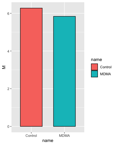
This is the most basic plot we can do, but we start by checking it and then adding layers in each iteration until we have what we want.
Add some error bars:
# add some error bars in the same manner
p <- p + geom_errorbar(aes(ymin = M - SEM, ymax = M + SEM),
                       width = 0.2)

p
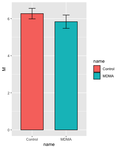
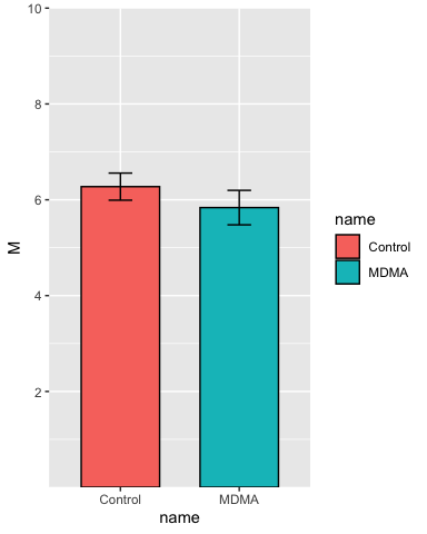
Set the y-axis limits:
p <- p + scale_y_continuous(breaks = c(2, 4, 6, 8, 10),
                            limits = c(NA, 10),
                            expand = c(0,0))

p
Add some labels:
p <- p + labs(
  title = "Predicted Efficacy",
  x = "Vignette Condition",
  y = "Predicted Efficacy of the Vignette Trial\n
  (10-Point-Likert Scale)"
)

p
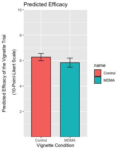
Centre the title, resize and recolor the x-axis titles, remove the legend and the plot background:
p <- p + theme(
  plot.title = element_text(hjust = 0.5),
  axis.text.x = element_text(color = "black", size = 10),
  legend.position = "none",
  axis.line = element_line(colour = "black"),
  panel.background = element_blank()
  )

p
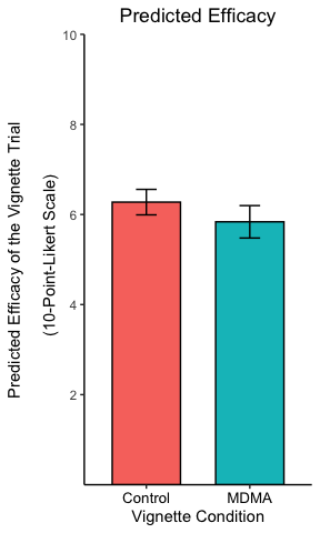
The theme settings can get very esoteric but allow a great deal of control over every element of the plot.
Reality
In the above text, I’ve been moving very slowly taking a single step at
a time. In practice, I would use a loop to import the data into a single
table, pipe the commands together using %>% and skip all the checks
and demonstrations once I’m sure the code works. This results in a much
shorter (tho maybe less readable) script. The entire process of import,
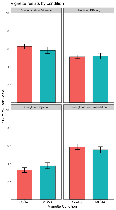
preprocessing and plotting each table looks like this:
path_to_excel_file <- "../assets/WRIGHT_t-tests_primary outcome data.xlsx"

# Use a named vector as a hash key to arrange the import
table_key = c(
  `Strength of Reccomendation` = "B3:C54",
  `Strength of Objection` = "E3:F54",
  `Predicted Efficacy` = "H3:I54",
  `Concerns about Vignette` = "K3:L54"
)

datatable <- tibble()
for (i in 1:length(table_key)) {
  each_table <- read_excel(path = path_to_excel_file,  # import here
                           range = table_key[[i]]) %>%
    pivot_longer(cols = c("Control", "MDMA")) %>%      # preprocessing here
    na.omit() %>%
    mutate(variable = names(table_key[i]))             # store the table name

    datatable <- bind_rows(datatable, each_table)      # one table to rule them all!
}

#### plotting ####
datatable %>%
  group_by(variable, name) %>%
  summarise(
    n = n(),
    M = mean(value),
    SEM = sd(value)/sqrt(n),
    .groups = "drop"
  ) %>%
  ggplot(aes(x = name, y = M, fill = name)) +
    geom_col(color = "black", width = 0.66) +
    geom_errorbar(aes(ymin = M - SEM, ymax = M + SEM),
                  width = 0.2) +
    scale_y_continuous(breaks = c(2, 4, 6, 8, 10),
                       limits = c(NA, 10),
                       expand = c(0,0)) +
    labs(
      title = "Vignette results by condition",
      x = "Vignette Condition",
      y = "10-Point-Likert Scale"
    ) +
    theme_test() +
    theme(legend.position = "none",
          axis.text.x = element_text(size = 10, color = "black")) +
    facet_wrap(~variable) # the new column ("variable") contained the table name